Taking designers straight out of the book my research initially leads me to the work of Ryan Gladhill. In the Graphic design example out of the book on page 17 or at http://graduate.mica.edu/gdmfa/2007/ryan-gladhill Ryan incorporated points, fine lines and planes to create the "Line/Shape Study." I am intrigued by the way such a simple used of shape and line thickness can define the positive and negative spaces so effectively. The razor sharp, fine lines are nice to look at and the circular movement across the space spreads the negative (white) space in a somewhat random way. There also seems to be multiple planes suggested in the size and displacement of the circles giving the flat piece some depth.
The focal point of this motion video at http://www.youtube.com/watch?v=Ns2sznGC4f0 is the line that this train is taking which shows how a single line can dominate the attention point of a space. I only mention this video to bring up how important the line is in defining where we look. Ihttp://motiondesign.files.wordpress.com/2007/04/c-2005-estate-jj-whitlapis.jpg Is a great example of graphic design that provides a nice example of both rhythm and balance. I like the blue colors too. Through the repetitions circles flowing out, the design has a way of moving the eye in an outward direction. The outer circles seem to move differently than the inner motion. The rhythm of the piece also gives the viewer and “eternal” sense about things. The balance of the graphic lays in it’s circular foundations and the dots and spirals forming their own perfect circles. In unison, the individual objects become a spinning plane.
In http://ny.beam.tv/beamreels/reel_player.php?jqbvsptxVy&resize=1&x=1&xip=47ed2909 , I love the rythym and balance of the lines flowing and how the rhythm and flow of the lines keeps essential cadence with the piano music in this motion piece. The lines are almost performing for the audience as if on a balance beam or something. I give this piece a big thumbs up for the balance of space as well and how the viewer is taken through time an effortless segment of time. The viewer is led on a journey essentially by the lines. The rythym and the balance is a nice too in the way it controls the pace of time through the video.
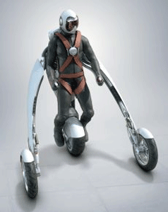
Scale is something that needs to be thought of in design because large shapes and small shapes place themselves in space. They also give the viewer a reference point with which to associate the rest of the space in the image. http://www.flickr.com/photos/markwitton/1386125619/. Scale also depicts what is or could be the real thing by relating the subject objectively in literal interpretation of something real. Even though the object may be something that is unfamiliar, scales helps us associate in our minds what it being relayed to our senses. http://www.bikerlawblog.com/media/blogs/wind/wearablemotorcycle.gif.
If you highlight over the reel on the right of the page, http://www.videocopilot.net/tutorials/futuristic_hud/ , you will see a nice motion representation of a scaled out image laid over the video of the man. The scale of the object (and the over lay) put the image directly in front of the man between the viewer and the subject. The perspective and scale of the digital HUD also imply space and distance from the man.
In the following image, http://www.flickr.com/photos/hogart/66785974/ the texture implied through the sharp lines and colors. This implied texture is virtual and not the real thing. http://www.flickr.com/photos/hogart/66785977/. The green lines in this one make the image have a“fuzzy” feel giving it a hint of texture and what the surface might feel like. In this video, http://www.youtube.com/watch?v=lCQ-EhSWkeM ,light colors and shades and gradients give the floor visible texture and a virtual sense of whatis happening. And in the beginning of this video, the texture of the “steel” ball is implied through the shades and sculpting of the graphics.