Dot, Line, Point
www.psyop.tv/aero - Motion
I really love this company that we found in another class of mine the other day, they have amazing colors and use of shapes. This is a really good example of dots used to create a picture in motion. Really this piece I think is such a great gathering or texture, dots and rhythm, the way thing everything comes together.
http://www.tiptopland.com/ - Website
The use of line in this website is very nice, though sometimes the dots can be a bit distracting, I think the lines are very bold and eyecatching.
Rhythm and Balance
www.psyop.tv/nokia - Motion
The rhythm in this is really subtle but it really stuck with me when I watched it, the way the music flows and the people along with it and as it picks up in speed so does the rhythm in the motion.
http://rareformbranding.com/ - Website
I think this website has a really nice balance between the imagery and the text, it's not too overpowering but your eyes flow really nicely throughout and your eyes seem to fall exactly where they want you too.
Scale
www.psyop.tv/mtvhd - Motion
This is the first piece I saw with this company and it really made me fall in love with them, the way they use the scale of the objects to transition through to new settings was really fluid and done with such amazing skill, you focus in on the birds throughout the entire commercial which keep changing in size and scale.
http://www.kvarch.com/ - Website
The scale used to navigate throughout this website is really amazing and keeps the users attention, its a really nice way to show off your work I think.
Texture
www.psyop.tv/smithnephew- Motion
The texture used in this commercial is just really beautiful as they slowly create each character and where there movement is being focused on, how you can see the yellow path that follows each one, I love how fluid the texture is I think it really matches the feeling of the brand and commercial.
http://www.davebarnes.com/ - Website
I love the texture effect in this website, it gives off the look of cutouts and it all really compliments each other really well.
Thursday, February 12, 2009
blog #3 websites
Plot, Line, Plane:
Website: http://acko.net/
Although this site is pretty standard set up with scroll downs to most recent news, the banner, and headlines use Plane and Line very well as well as color to create a depth of field. I found this site to various diagonals to create a sense of weighty 3 dimensional line. The navigation bar on terms of aesthetic as well as the entire site has a lot of appeal, and looks very slick.
Rhythm, Balance:
Website: http://music.vodafone.com/
This site I found to have incredible balance and interactivity. The most apparent balance and rhythm is from the color Using almost a muted color scheme but contrasting that with some brighter colors, and using very simplistic shapes which you can throw around and have them effect the other. Very fun little site.
Scale:
Website: http://www.designbyhumans.com
This is a pretty cool t-shirt company which sells shirts designed by people. First off though the way they place each page is very unique in the way you navigate through the pages which brings you to see each new shirt in the foreground someone wearing it and re-emphasis' it by placing the same image on the t-shirt in the background. Personally I thought the design of the pages in advertising the shirt was a very nice way to emphasize the "art" on the shirt whereas many other sites its very hard to tell whats even on the shirt.
Texture:
Website: http://www.happyingreenville.com/
This website I found to be a playful for St Francis Health. It used a light childish soundtrack but more importantly it told a story of a town in the way of using child-like drawings and simple pencil textures. I thought this was an incredible site by advertising a hospital which is usually associated with sickness, and trying to make it seem a lot less stressful by using this cheerful adaptation to help its patients.
Blog 3
Dot, Line, Point
http://www.youtube.com/watch?v=dIYrLoO9GYA
This animation contains quite a few good examples of line and shape. The characters and forms are constantly morphing into something else, so the lines are always changing, creating new shapes. I love how fluid the motion is.
http://www.relientk.com/home.aspx
This website uses lines in interesting ways. The diagonal green lines create motion, and the scribble lines give the page more texture and interest. I like how the tables are not made of up even lines, but rather sloppy, pencil lines.
Rhythm and Balance
http://www.klf.org/
This site has a lot of rhythm to it. The cloud shapes help move the eye across the page, in a very rhythmic way. The logo even has intersecting lines that seem to cause more rhythm. The page overall feels very balanced as well.
http://www.youtube.com/watch?v=oP5J4W5GQ3w
This advertisement for Sony is amazing. Thousands of tiny balls bounce down a hill in San Fransisco. The balls create lots of rhythm and motion, and the song playing in the background also helps tie in the rhythm of the balls.
Scale
http://www.yellowicon.com/
Yellow Icon’s website uses interesting scaling. The text and buttons are all relatively tiny, while the pictures are quite large, giving a greater contrast between the two. This also gives an elegant look to the whole page.
http://www.youtube.com/watch?v=YwNVE37BGVE
This is a funny animation about a bunny who’s depressed about his sex life. Several times during the animation, the bunny changes his location in relation to a fixed camera. His scale changes quite significantly. Other bunnies in the background and foreground better define the scale of the pieces as well.
Texture
http://macthemes2.net/
This website contains a lot of interesting textures. The desk-like layout has been used many times in the past, but this site pays attention to the minor details, giving it a much more realistic look. The blue graph paper is a great texture.
http://www.youtube.com/watch?v=tch8mHk81ug
This is a cool, somewhat creepy cg animation about an futuristic apocalypse. The textures and lighting are beautiful throughout. The human-like characters are realistic and again, the lighting and shading is beautiful.
Second Post
RHYTHM AND BALANCE:
http://www.us.playstation.com/patapon/ -Patapon Rhythm and Balance Web- this is a playstaion portable games website, the choice of color and placement give great balance.
http://www.youtube.com/watch?v=QWkcO00Rfos - T Pain Rhythm and Balance Motion- this video use of complimentary colors and composition are what stand out to me.
SCALE:
http://www.youtube.com/watch?v=g2VCfOC69jc –Honda ad Scale Motion- this commercial uses scale of items and car parts to give a good varity of scale that make this ad work well.
http://na.square-enix.com/starocean/ – Star Ocean scale web- the scale of the main hero is giantgantic compare to the planets allude to a epic quest. It works.
TEXTURE:
http://www.youtube.com/watch?v=sLV28V9984g&feature=related – lrg drawing human texture motion, this add uses humans as texture and it is very interesting.
http://www.littlebigworkshop.com/en-us/ Little big planet texture web. This website has so many different textures that give great depth.
POINT LINE PLANE:
http://www.youtube.com/watch?v=G0LtUX_6IXY – human Tetris point line and plane motion.
http://na.square-enix.com/remnant/landing.html Last Remnat Point line plane web, with this site I wanted you to focus on the firey flame points that give and average page movement.
designElements
Motion Design
Point Line Plane Guinness
This piece represents the epitome of the use of these three elements. It uses a dot to sprout and propel all the motion in this video, by creating lines that turn into shapes defined by the movement of the dot. The lines that are created divide the space in dynamic ways to create effective and interesting compositions. Plane is used as a staging ground for creation of differnt scenes in which the dot plays a different role every time.
Rhythm and Balance Lugz
This commercial uses line as a very active element which defines the depth of the space present around the breakdancing figure. The line is generated in form of a stroke in such a way that compliments the dancing of the figure, giving it a sense of balance. The speed at which the stroke is generated reflects the beat of the music creating a rhythmic path for the viewer's eye to follow.
Scale Renault Clio
The use of scale in this commercial is very clever, it has a playful approach to how scale works in the real world. It uses a very large scale for the main character to exaggerate his presence in the video and to show a fun interaction between him and the other people in the video.
Texture Canalplus - nodomain
This piece uses texture formed from repetition of oe object as the main elements of the piece. The texture is that of fluffy clouds that cover a landscape, the texture is used effectively because it bring a level of suspense at first and then aids in the dilevery of the message by forming into a word.
Web Design
Point Line Plane HYPE
The HYPE communication website uses all three of these aspects quite well, in that they all work together to create an organized and efficient interface. The lines form connections between a category and the links within it which are represented by circles that can be considered points. Even though the points are arranged in a seemingly ambiguous fashion they are well balanced and through subtle movements generate interest in that part of the composition. Behind all of the lines and points are larger planes in the shapes of circles, which serve the purpose of dividing the page into coherent chunks for easy visual digestion by visitors to the site.
Rhythm and Balance What a lovely Name
This website uses a lot of patterns in its design to allow the viewers eyes to progress rhythmically across the choices with which they are presented. The website also achieves balance through the use of these patterns, though I must say that its so balanced that it becomes monotonous after viewing the website for more than about twenty seconds, so perhaps too much balance is not a good thing...
Scale Vodafone
Scale is used effectively in this site as it creates a very distinct hierarchy among the elements. The bigger elements demand the viewer's attention be focused on them and are the source of the websites purpose, while the smaller elements provide access to additional information supporting the sites goals.
Texture Helmy Bern
This site uses texture to convey its brand as a brand that these extreme sports enthusiasts can relate to. The cardboard textures used to house the menus act as a link to the homegrown origins of their products as well as the origins of extreme sports. The darker asphalt-like texture in the background gives the necessary context for product placement in the minds of the site's visitors.
Wednesday, February 11, 2009
Graphic Design Basics in Motion/Web Design
Plot, Line, Plane:
Motion Design: http://www.eyeballnyc.com/ (under live action)
About half way through the clip point, line and plane (mostly line and plane) are used to create a moving plane in which the dancers move on. The lines and overall composition are what make the motion and transitions in the clip.
Web Design: http://yehrin.proteinos.com/typography/index.html
Although this is really on print, I liked it so much I posted it. The series of planes really sharpens the letters in a dynamic way. They also create a beautiful series of shapes the bring the eye right in to the main focus.
Rhythm, Balance:
Motion Design: http://www.imaginaryforces.com/featured/7/514
The rhythm in this clip follows a certain pace and is visually demonstrated through the movement of the Pepsi logo and the type. Each time the clip progresses of the letters, or logo, move there is a new balance for each shot.
Web Design: http://www.capacity.tv/
The little characters interacting with the word “Capacity” direct the viewer across the word in a very smooth “s-shape”.
Scale:
Motion Design http://www.capacity.tv/ (click the “Click here for rebrand montage”)
Throughout the clip, we see the characters close-up, far-away and them traveling in between which helps the motion progress from one character to another. If the character is going away from the viewer, then they become small to recede. The opposite occurs when the characters get close to pop out at the viewer, consuming the eye.
Web Design: http://www.abelic.net/
The large scaled background image of the sunken ship dominates the webpage compared to the small scaled navigation left of center.
Texture:
Motion Design: http://www.eyeballnyc.com/
The texture in this motion is very interesting because it communicates the carbon footprint idea and it interacts beautifully with the characters in the piece.
Web Design: http://www.melkadel.com/
This site was designed to look like a sketch pad and is successful in doing so through the use of texture representative of different kinds of paper.
Thursday, February 5, 2009
Blog Entry 3
Taking designers straight out of the book my research initially leads me to the work of Ryan Gladhill. In the Graphic design example out of the book on page 17 or at http://graduate.mica.edu/gdmfa/2007/ryan-gladhill Ryan incorporated points, fine lines and planes to create the "Line/Shape Study." I am intrigued by the way such a simple used of shape and line thickness can define the positive and negative spaces so effectively. The razor sharp, fine lines are nice to look at and the circular movement across the space spreads the negative (white) space in a somewhat random way. There also seems to be multiple planes suggested in the size and displacement of the circles giving the flat piece some depth.
The focal point of this motion video at http://www.youtube.com/watch?v=Ns2sznGC4f0 is the line that this train is taking which shows how a single line can dominate the attention point of a space. I only mention this video to bring up how important the line is in defining where we look. Ihttp://motiondesign.files.wordpress.com/2007/04/c-2005-estate-jj-whitlapis.jpg Is a great example of graphic design that provides a nice example of both rhythm and balance. I like the blue colors too. Through the repetitions circles flowing out, the design has a way of moving the eye in an outward direction. The outer circles seem to move differently than the inner motion. The rhythm of the piece also gives the viewer and “eternal” sense about things. The balance of the graphic lays in it’s circular foundations and the dots and spirals forming their own perfect circles. In unison, the individual objects become a spinning plane.
In http://ny.beam.tv/beamreels/reel_player.php?jqbvsptxVy&resize=1&x=1&xip=47ed2909 , I love the rythym and balance of the lines flowing and how the rhythm and flow of the lines keeps essential cadence with the piano music in this motion piece. The lines are almost performing for the audience as if on a balance beam or something. I give this piece a big thumbs up for the balance of space as well and how the viewer is taken through time an effortless segment of time. The viewer is led on a journey essentially by the lines. The rythym and the balance is a nice too in the way it controls the pace of time through the video.
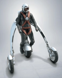
Scale is something that needs to be thought of in design because large shapes and small shapes place themselves in space. They also give the viewer a reference point with which to associate the rest of the space in the image. http://www.flickr.com/photos/markwitton/1386125619/. Scale also depicts what is or could be the real thing by relating the subject objectively in literal interpretation of something real. Even though the object may be something that is unfamiliar, scales helps us associate in our minds what it being relayed to our senses. http://www.bikerlawblog.com/media/blogs/wind/wearablemotorcycle.gif.
If you highlight over the reel on the right of the page, http://www.videocopilot.net/tutorials/futuristic_hud/ , you will see a nice motion representation of a scaled out image laid over the video of the man. The scale of the object (and the over lay) put the image directly in front of the man between the viewer and the subject. The perspective and scale of the digital HUD also imply space and distance from the man.
In the following image, http://www.flickr.com/photos/hogart/66785974/ the texture implied through the sharp lines and colors. This implied texture is virtual and not the real thing. http://www.flickr.com/photos/hogart/66785977/. The green lines in this one make the image have a“fuzzy” feel giving it a hint of texture and what the surface might feel like. In this video, http://www.youtube.com/watch?v=lCQ-EhSWkeM ,light colors and shades and gradients give the floor visible texture and a virtual sense of whatis happening. And in the beginning of this video, the texture of the “steel” ball is implied through the shades and sculpting of the graphics.
Subscribe to:
Posts (Atom)